
|
Snap Graphs
| ➢ Snap Graphs (Sample) |
|---|
|
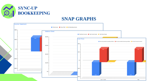
The Snap Graphs report provides a visual representation of a company's financial performance, using bar graphs to illustrate key data from the three main financial statements: the Income Statement, Balance Sheet, and Statement of Cash Flows. This graphical presentation allows for quick and easy identification of trends, comparisons, and potential areas for improvement. The report includes the following graphs:
By analyzing the Snap Graphs report, businesses can gain a quick and intuitive understanding of their financial performance, identify areas for improvement, and make data-driven decisions to optimize their financial health. |
Snap Graphs:
Key Concepts & Connections
Concepts Related to
Snap Graphs

Snap Graphs are a powerful form of visual Financial Statement Analysis that make it easy to perform Horizontal Analysis by spotting trends at a glance. These graphs often chart key Financial Ratios to provide a quick understanding of a company's Profitability and Liquidity without needing to read through pages of numbers, giving you a clear view of your overall financial health.
Snap Graphs
in Action:
The Adventures of Coco and Cami

Coco and Cami are looking at their Monthly Snap reports. While the numbers are helpful, as visual people, they find it hard to see the "story" in the columns of data. Is revenue *really* trending up, or was last month just a fluke?
Professor A introduces them to the Snap Graphs report. He shows them their sales and expense trends as simple bar charts. Instantly, they can see the seasonal peaks and valleys of their businesses. The visual format makes their financial data "click" in a new way, helping them understand their performance more intuitively.